
Prototype Logic:
Case Studies in Constraint.
A technical archive from our Turkish game studio. Every project here is a test bed—where core mechanics collide with hard performance budgets, and UI is built to serve narrative, not just instruction. These are not finished products; they are documented decisions.
The 'Neon Drift' Prototype
Physics as Narrative
The core loop of this minimalist racing concept isn't about winning. It's about managing a momentum debt system. Every boost creates a future deceleration penalty, visualized as a trailing, bleeding energy shadow. We designed this to tell a story of reckless momentum and consequence.
Side-note: The 'shadow' isn't just a visual flair. Its opacity is tied directly to the debt variable, serving as a persistent, unmissable feedback loop.
- • UI Innovation: The tachometer is a reactive ring that distorts under stress, pulling focus to the screen's center. It's built with SVG filters for GPU-accelerated deformation.
- • Aesthetic Constraint: Every asset derives from a single teardrop vector, morphed through 12 keyframe states. This kept our asset pipeline to under 500KB of texture data.
- • Performance Note: Particle trails use a custom shader that degrades gracefully. On low-end devices, it falls back to a simple trail of sprites, maintaining the illusion of speed.
Trade-off Frame
Benefit
High-contrast, monochrome palette creates immediate atmospheric cohesion and reduces visual noise, ideal for the genre.
Cost
Sacrifices immediate readability of distant UI elements, which we mitigated with a dynamic focus bloom effect on the center screen.
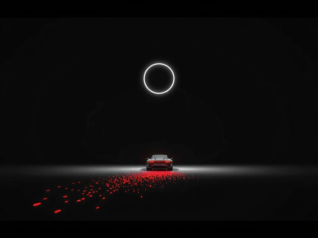
Figure 1: "Momentum Debt" visualized. The trailing shadow's opacity scales linearly with the debt variable, providing real-time, ambient feedback.
A Taxonomy of Touch
Input Schemes for 'Tactile Echoes'
Scroll to visualize cognitive load patterns (simulated)
Swipe-Sustain
Short swipe sets direction, sustained press activates. Designed for low error rate in rapid sequences.
Pinch-Pulse
Pinching creates radial shockwaves. Intuitive for area-of-effect actions, mimics a physical 'compression'.
Tap-Trace
Tapping a node and tracing to another. High precision for puzzle logic, requires muscle memory.
The 'Glitch Garden'
A Post-Mortem on Procedural Art
The goal: generate organic, non-repetitive flora for a narrative game. The reality: thousands of failed permutations. This is how we documented the failure and built a system that worked.
Method Note: Robustness Test
We evaluated solutions on two axes: Asset Uniqueness (no two plants identical) and Render Time (ms per asset). We rejected any method exceeding 50ms on our target mid-tier device.
- Initial: Perlin noise directly (Failed: too 'blobby', low uniqueness)
- Breakthrough: Cellular automata over Perlin (Selected: high uniqueness, 42ms)
- Pitfall: Realism shaders (Rejected: inflated render time to 120ms)
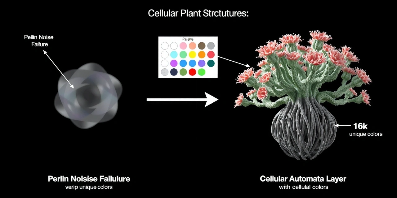
Diagram: The convergence of Perlin fields and cellular automata to create unique branch structures.
"Beta testers described the world as 'alive but unsettling.' That was the exact emotional target. The procedural generation wasn't just for efficiency; it created an ecosystem that felt inherently wrong, but beautifully so."
Constraint
"No asset can be wider than 40 pixels."
Forced a modular, tileable system.
Trade-off
Flat-color style vs. Realism.
Sacrificed depth for performance and cohesion.
Diegetic UI Glossary
A lexicon of terms from our 'UI as Diegetic' manifesto. Our view is that every UI element should have a plausible in-world origin.
No Diegetic HUD
The health bar or ammo count exists on the character's gear or the environment itself.
We use this to force stronger environmental storytelling. A crack in the visor is more evocative than a red bar.
Contextual Input Mapping
Touch controls reconfigure based on action (climbing vs. weapon aiming).
Reduces cognitive load by matching the gesture to the physical metaphor. The trade-off is increased dev time for state management.
Failure State as Narrative
A flickering UI element isn't a bug; it's part of the story (e.g., system damage).
This blurs the line between gameplay and story, but requires careful design to avoid being misinterpreted as a technical flaw.
Tactile Resonance
UI feedback must have a physical metaphor (a 'clunk', a 'snap', a 'resistance').
For 'Tactile Echoes,' this meant haptic patterns that matched the visual shockwave, not just a generic buzz.
The Pause Menu is an Object
Pausing the game pulls up a physical datapad or journal in the world.
Maintains immersion, but breaks traditional UX patterns. Requires intuitive placement and clear exit signals.
Glitch as Intent
Digital artifacts and screen distortion are narrative cues, not rendering errors.
We use this to signal danger or narrative breaks. The key is consistency so players learn to read the glitch language.
Ready to build your case study?
Our next project needs a partner who understands that constraints are creative tools. Let's discuss the technical reality of your idea.
Project Selection Navigation
Palette Interaction Test
Hover over swatches to see micro-interaction (scales up, gains glow).